UX + Frontend
Personal project demo
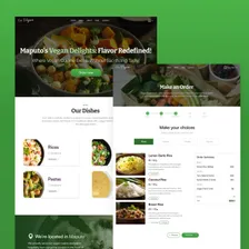
Go Vegan Website
Food ordering for a fictional restaurant, from UX research to a web interface.
- UX Research
- Interaction Design
- Frontend

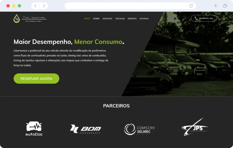
The company's website redesign now allows customers to book reprogramming services online for a variety of vehicles, including boats, cars and motorcycles.
The project at a glance
A website redesign and implementation for a vehicle remapping business, connecting service information, online bookings and administration.
Help visitors understand the services and provide the vehicle and appointment information needed to request a booking.
The public booking journey and the administration interface serve different tasks. Vehicle, service and customer data connect the two through a separate API.
I am extremely impressed with the new look of our website. The website now looks more modern, professional and easy to use. The new interface also helped to highlight our vehicle reprogramming services, which I am sure will attract more customers to our business.

Heike Pinto
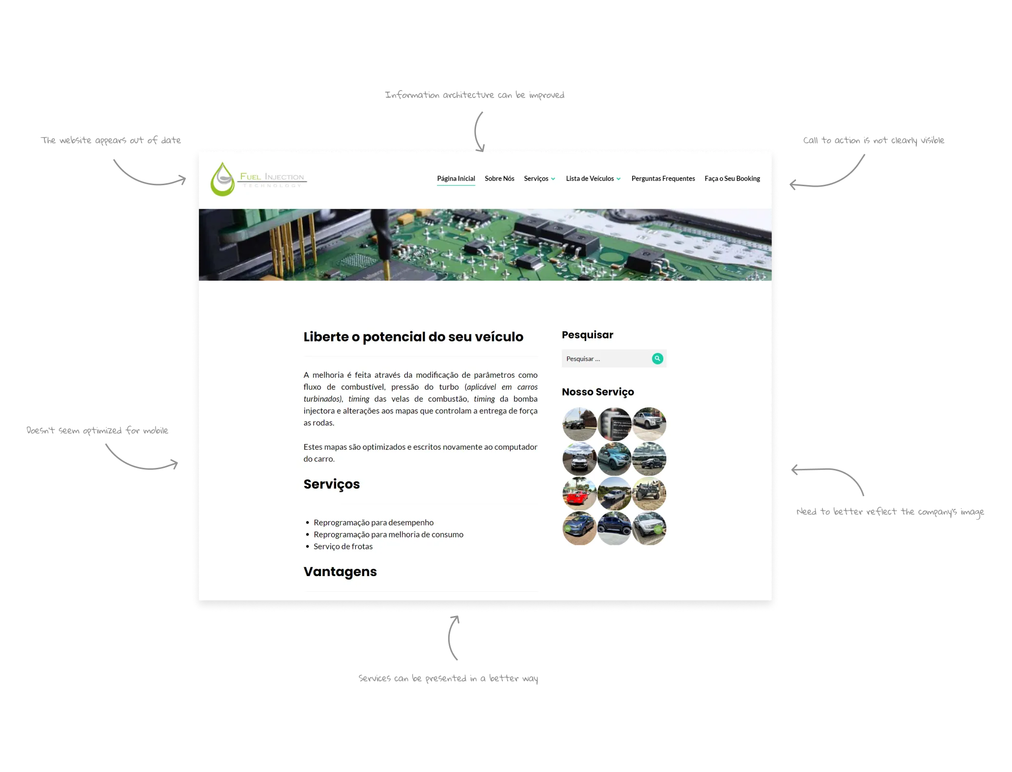
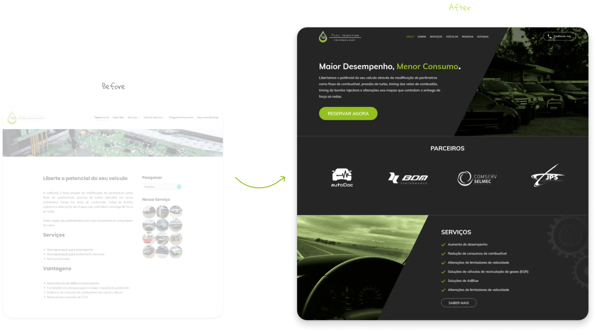
Founder of Fuel Injection TechnologyBefore starting the redesign work, the first step I addressed was identifying the existing problems on the current website, as well as the reasons that led to the need for a visual change. After careful analysis, we were able to reach some conclusions that served as the basis for the design strategy.
In the second phase of the research process, although the Fuel Injection team already had some preliminary ideas to improve the website's appearance, the main focus was directed to the detailed analysis of the demographic, psychographic and attitudinal information of the company's customers, in order to obtain an in-depth understanding of your target audience.
Demographic Information
Age range: 20-49 years
Mostly adults
Mostly male
Communication channels
Phone call
Challenges
Understand how reprogramming services work
Difficulties in finding out the price of customer vehicle services on the website
They prefer to access using a mobile platform than a desktop
Psychographic Information
Passionate about motorsport
They care a lot about the aesthetics of their vehicle
They value fuel savings and increased performance of their vehicle
After carefully defining the target audience for this project, I created a strategic diagram, providing a clear and comprehensive view of the project's objectives. This diagram was crucial in guiding the design process, ensuring that the client's needs, user expectations and my goals as a Designer were aligned, resulting in an efficient and user-centric approach.
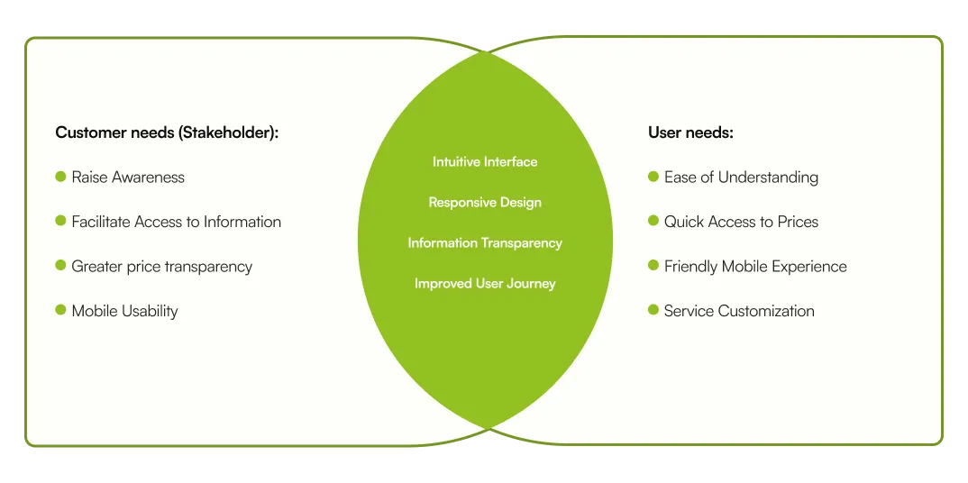
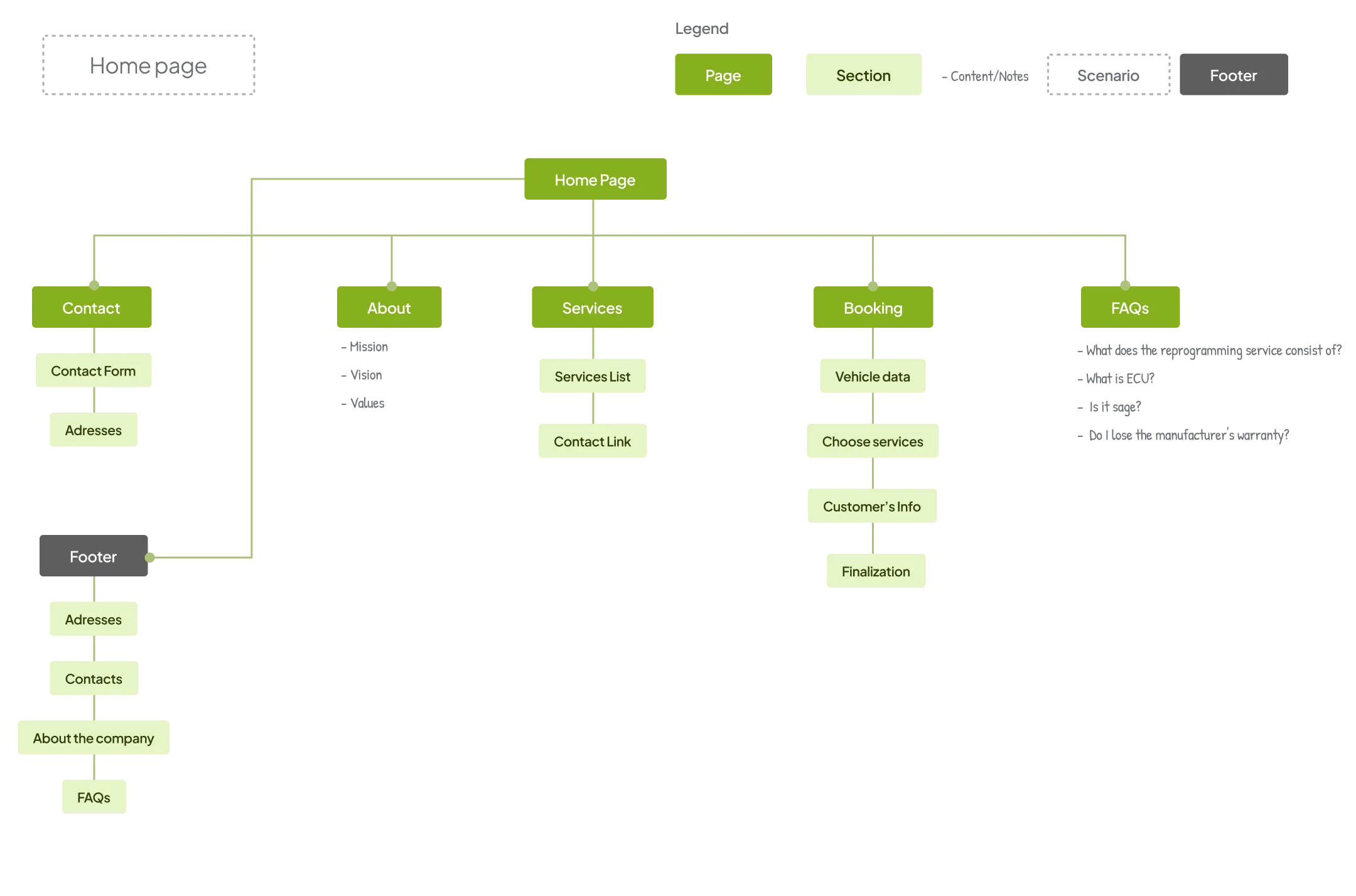
After defining the project's objectives, I created a strategic diagram that served as the basis for the ideation phase. In this step, we develop a comprehensive sitemap, neatly mapping out the structure of the site. This structured approach allowed a fluid transition to the subsequent phases of the project, ensuring coherence between the objectives, the user experience and the practical implementation of the ideas.
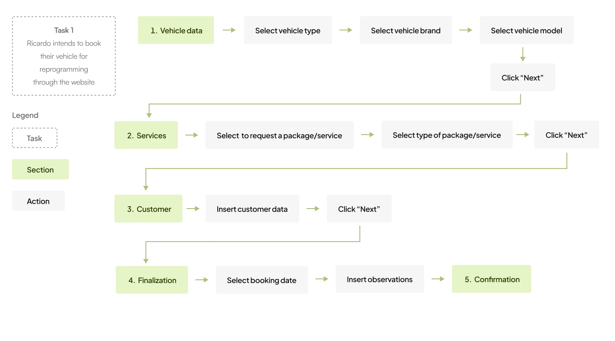
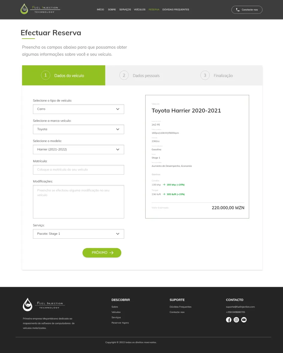
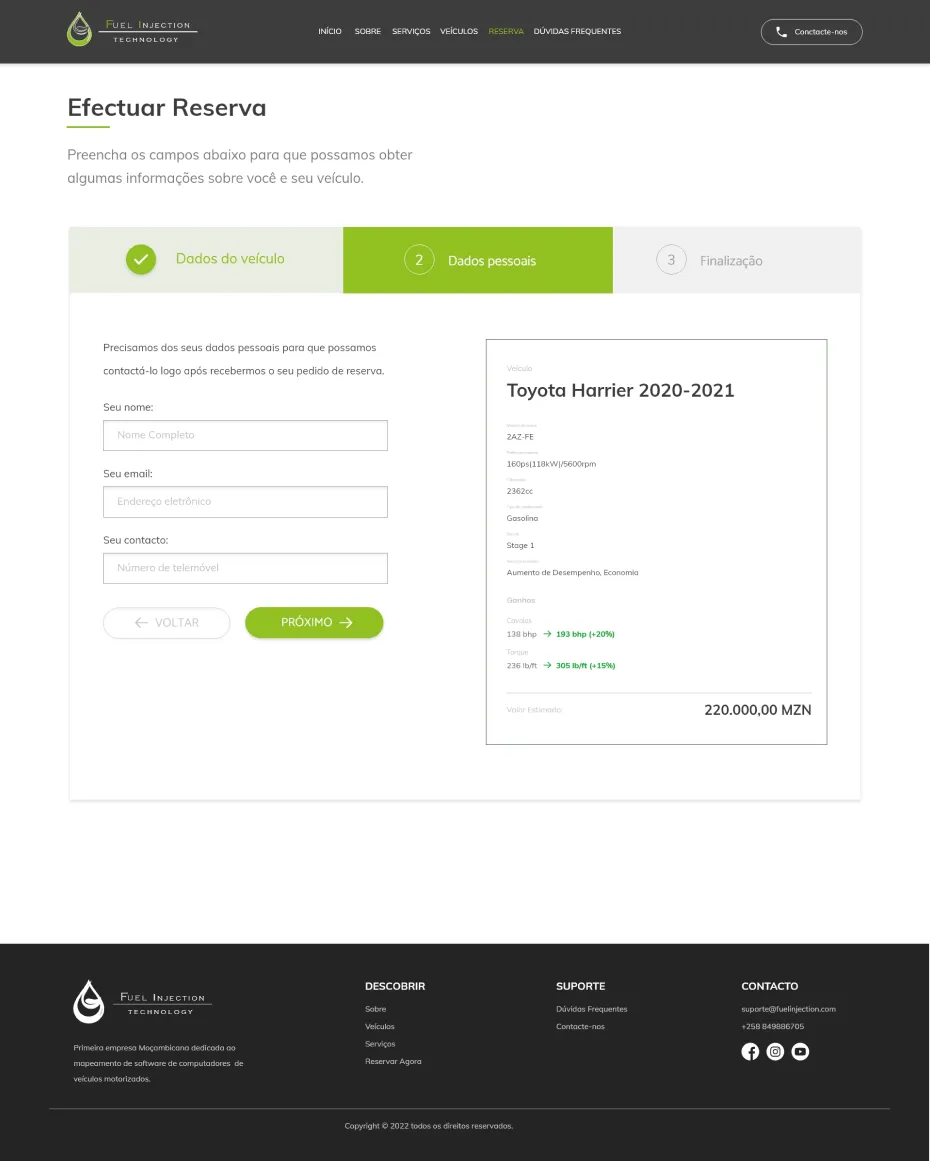
A crucial feature of the website was to enable Fuel Injection customers or potential customers to make reservations for reprogramming their vehicles online, whilst simultaneously presenting the potential gains in vehicle performance during filling. To achieve this goal, I developed a task flow to evaluate and improve the customer experience, ensuring an efficient and informative booking process.
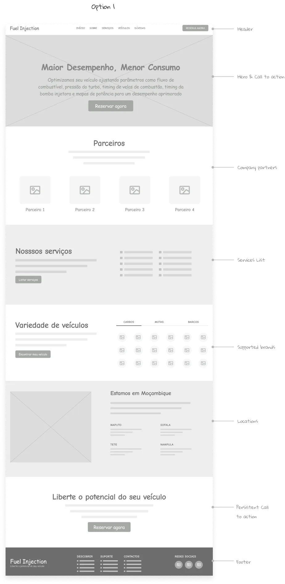
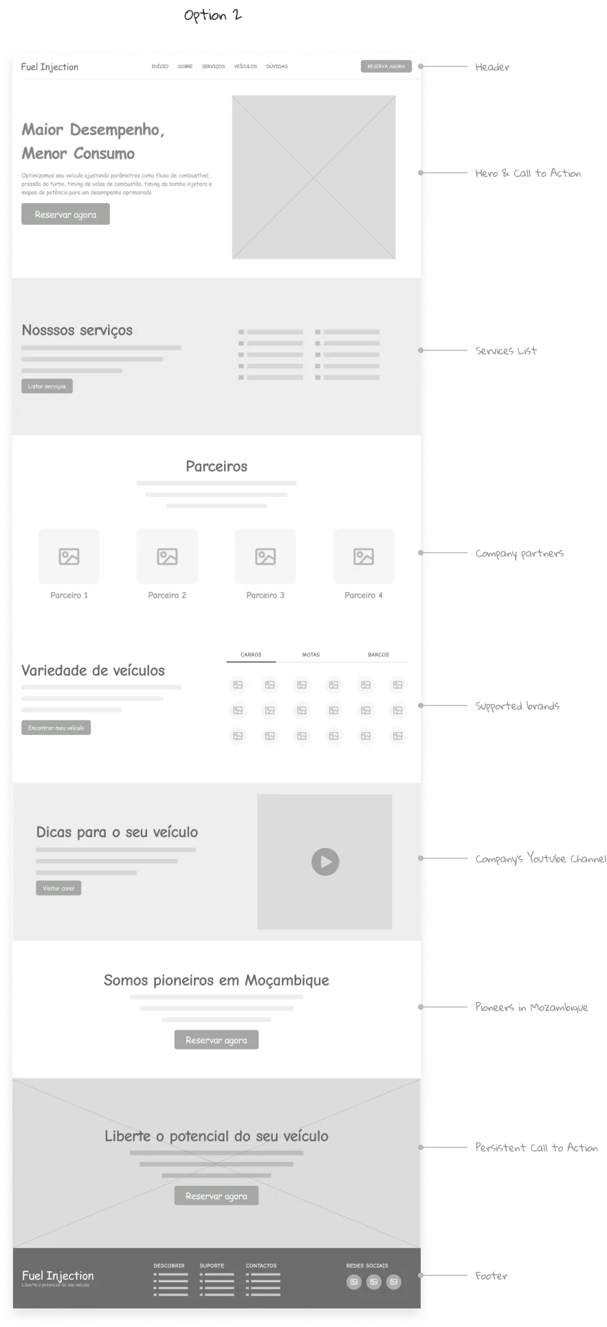
After data collection, we move on to the prototyping phase. I developed several versions of wireframes for the home page, discussing ideas with stakeholders. In the end, we decided to create a combined version, integrating sections from different wireframes to achieve the ideal homepage.
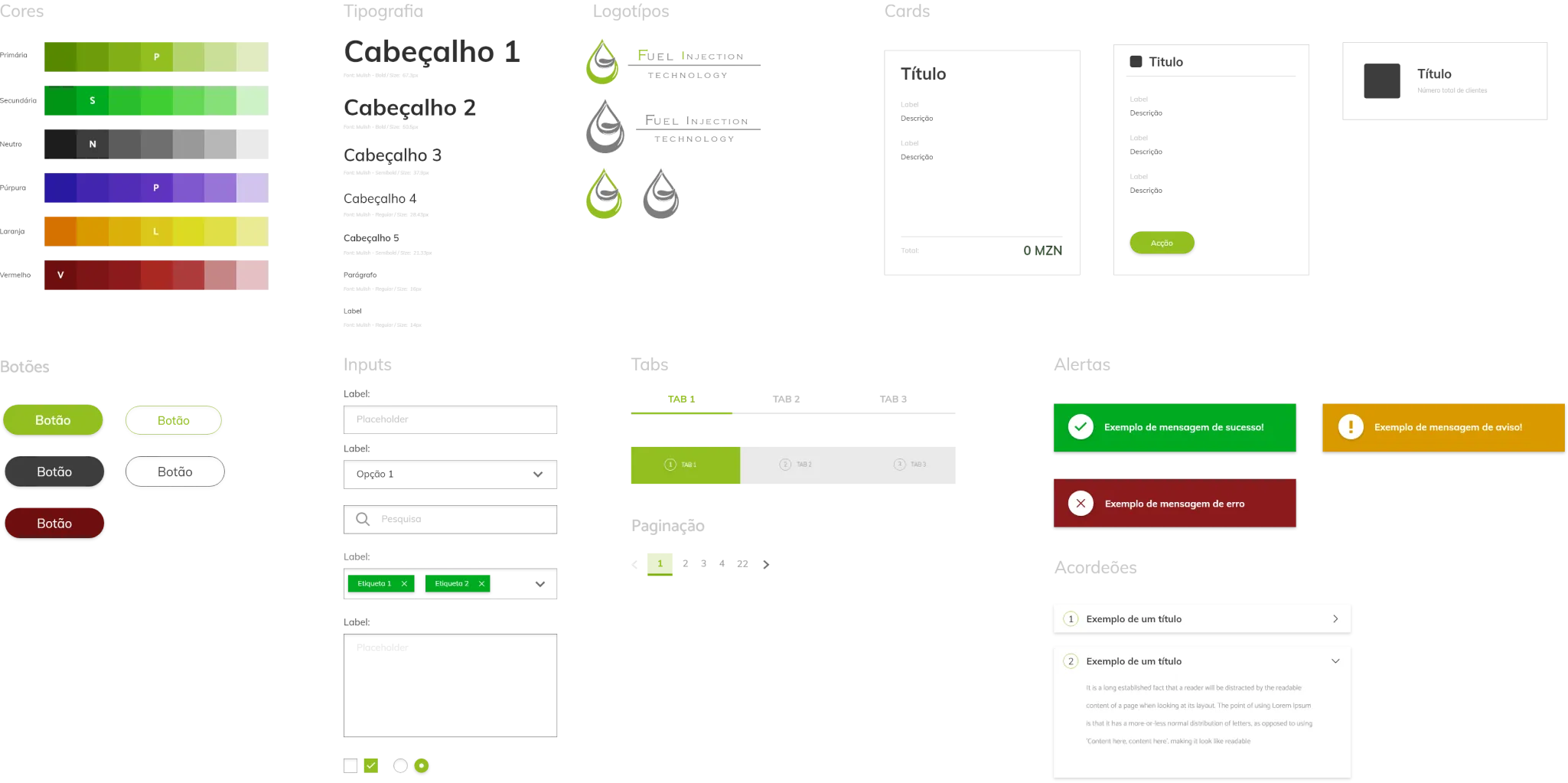
Later, I moved on to creating visual styles and components, ensuring a cohesive and attractive implementation not only on the home page, but on all pages resulting from the fusion of the different versions of the wireframes.
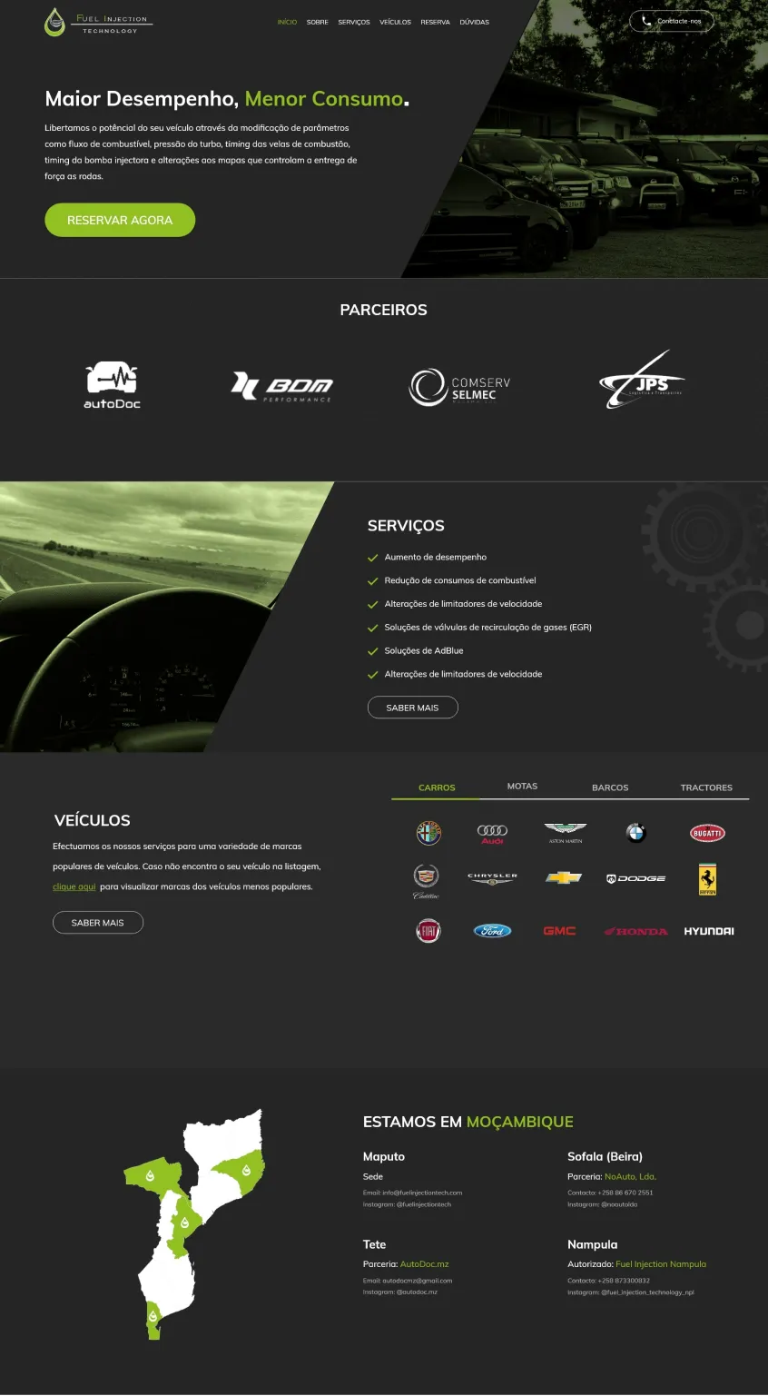
Next, I focused on creating high-fidelity mockups. Based on the previously developed visual styles and components, I sought to create detailed and accurate visual representations, providing a complete and realistic visualization of all project pages.
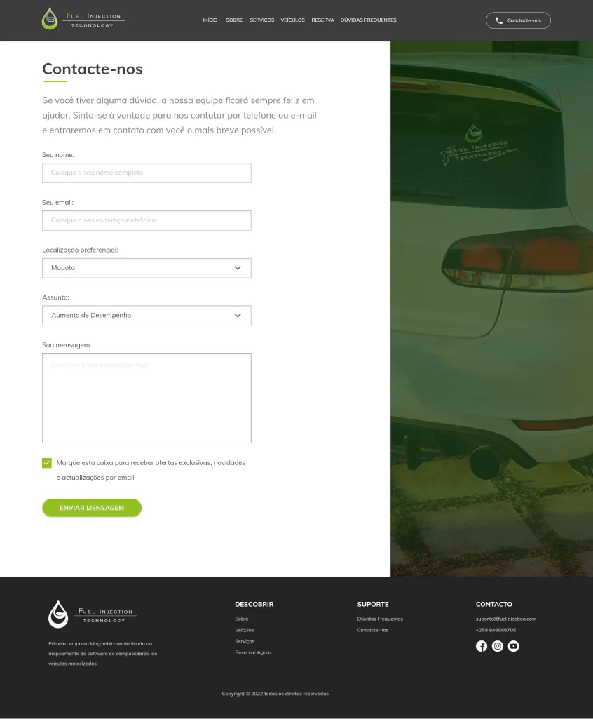
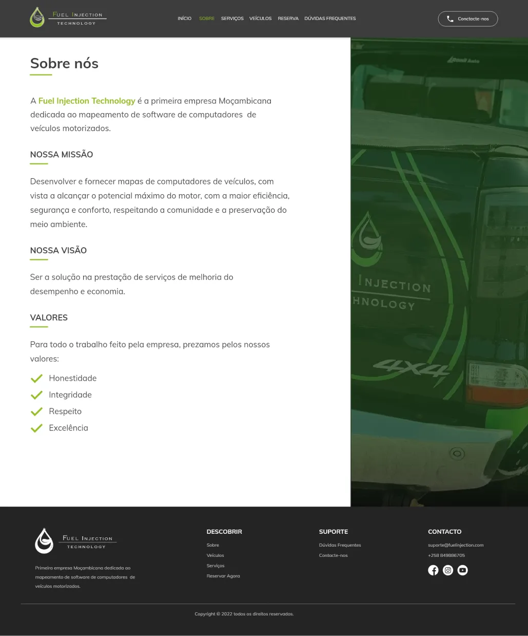
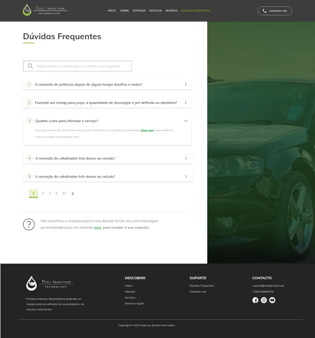
The reservation request process has been thoroughly evaluated numerous times, making it the most important flow to be improved on the website, as it is the section responsible for converting new customers to the company.
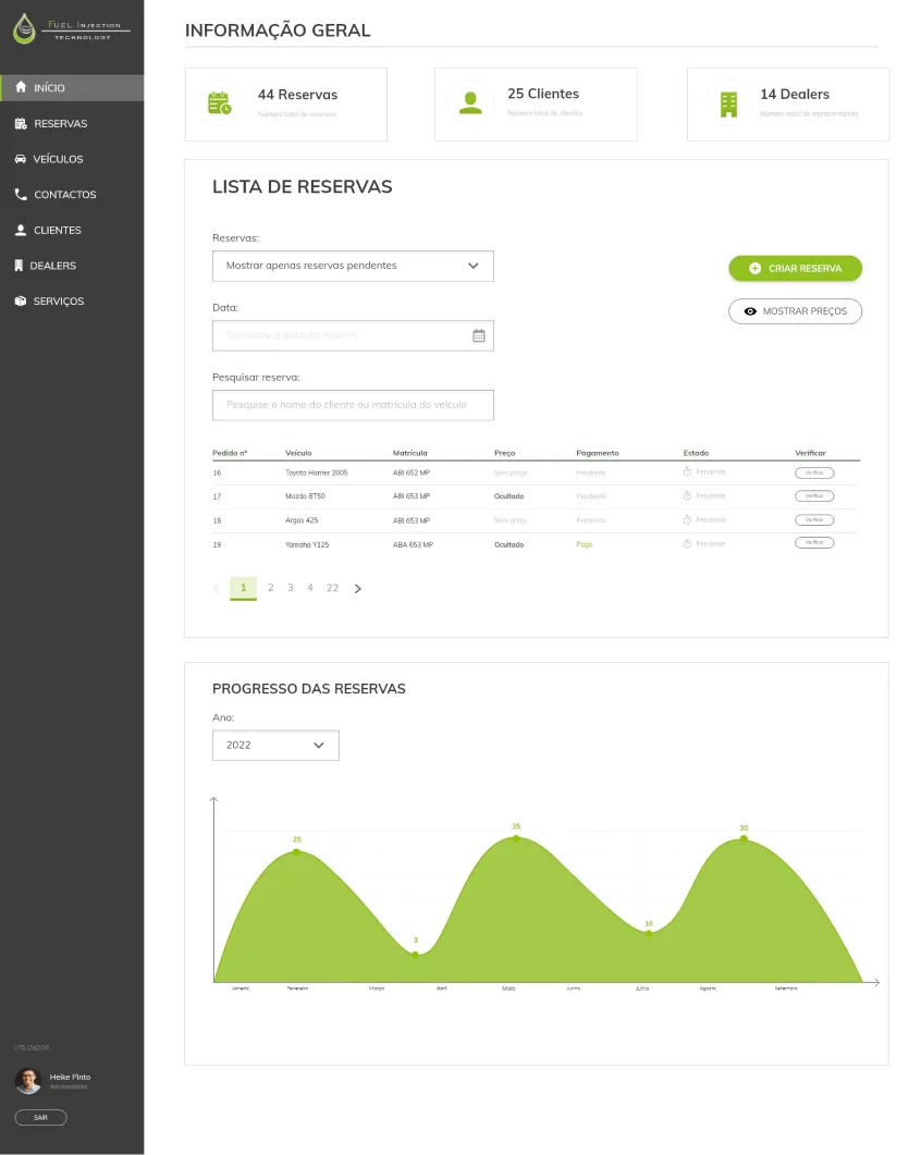
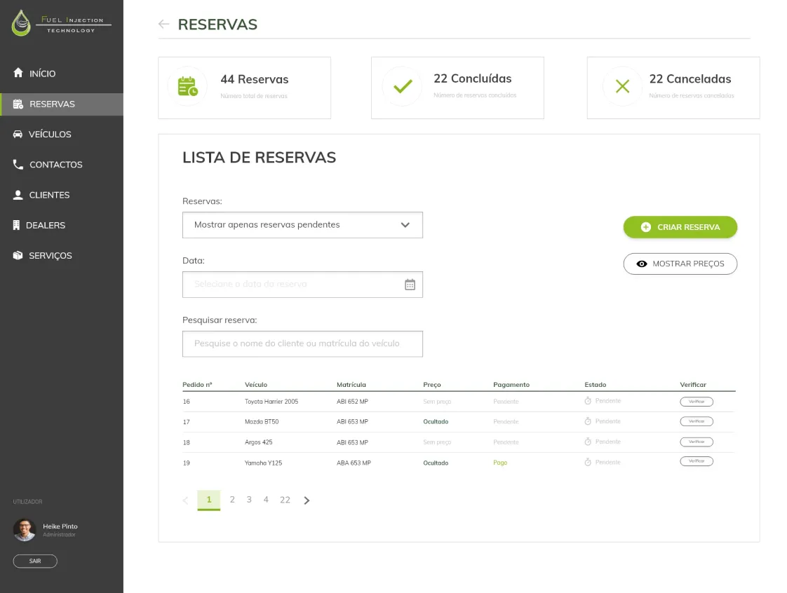
I thought about creating mockups not only for the website, but also for the administration panel, as this would not only provide critical reports, but would also allow managing vehicles, contacts and reservations on the website.
After creating the mockups, during the website redesign process, I tested the new image with stakeholders. The founder, recognizing the importance of practical feedback, granted the privilege of testing the experience with some of the company's loyal customers. The objective was to evaluate aesthetics, ease of use and verify the convenience of making online reservations, ensuring that the new approach met users' expectations and needs. I asked them to rate each of these criteria on a scale of 1 to 5, allowing for a more precise and detailed analysis.
The sessions gathered ratings and qualitative feedback on the proposed experience. Notifications, a gallery and English support emerged as requests to consider in later iterations.
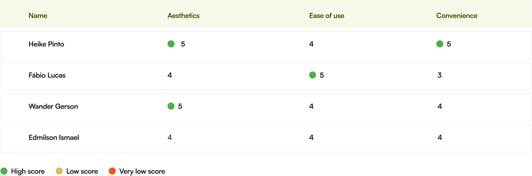
During the tests, in addition to evaluating, users provided valuable feedback, presenting relevant comments that enriched the website improvement process. Their observations covered crucial aspects, from usability to suggestions for additional features.
The online booking experience was easy and quick. I would suggest adding a notification system to inform customers about the service status after booking.
I liked the modern aesthetic of the site, but it would be interesting to have a before and after gallery of reprogrammed vehicles to visualize the results.
As a fluent English user, I think it would be very useful if the site supported the language. This would make navigation easier for me and other international customers who also speak English.
Stakeholder collaboration helped select the visual direction, while feedback from customers highlighted the booking journey and further needs such as notifications and language support.
The design direction continues into the public booking flow and administration implementation. The study’s customer feedback is qualitative; the code section below explains how the interface connects to the API and stored data.
Preview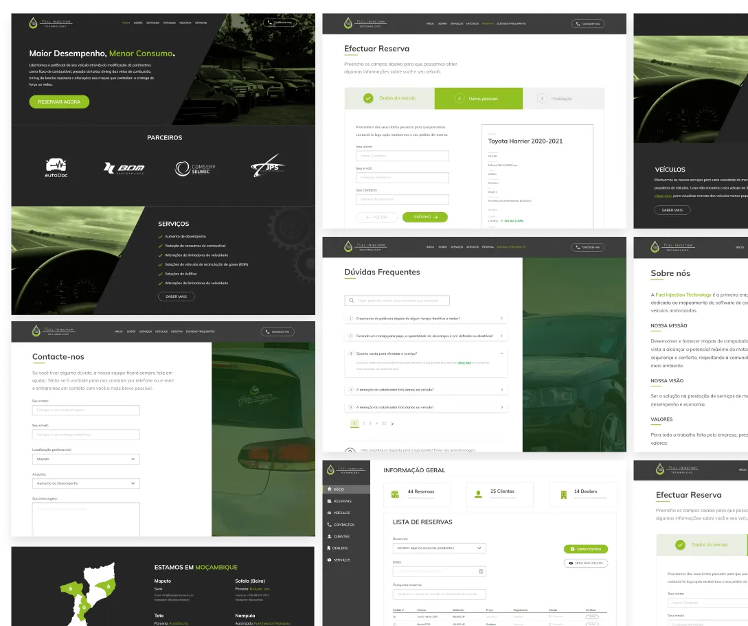
From design to implementation
A Nuxt/Vue frontend implements the public website and administration interface. A separate ASP.NET Core API handles the booking data, with Entity Framework Core and SQL Server for persistence.
Vehicle, service, customer and finalisation are separate Vue components. The parent coordinates the steps and keeps the entered values while moving forwards or backwards.
Vuex modules and Axios organise access to vehicles, packages, services and bookings. The backend separates controllers, DTOs, repository contracts and data access.
Vuelidate checks required form fields before progressing. Data-dependent steps also represent loading, empty results and request failures, with retry actions.
The dashboard implements booking filters and pagination, price updates and completion status. Corresponding API actions persist those changes through the booking repository.
Small form components keep each step focused, while the API coordinates the stored records. The booking flow also depends on catalogue requests, so its loading and failure states are part of the interaction design.