UX + Frontend
Personal project demo
Go Vegan Website
Food ordering for a fictional restaurant, from UX research to a web interface.
- UX Research
- Interaction Design
- Frontend

An online platform aimed at individuals who prepare food at home, facilitating the management of their stocks in sync with their sales activities.
The project at a glance
A collaborative product and UX concept for people running food businesses from home, developed with Márcio Ngulube.
Understand how home food businesses track ingredients, stock and sales, and make that work easier to organise.
A product concept developed through research, user flows, sketches and interface prototypes. The work presented here ends at the prototype stage.
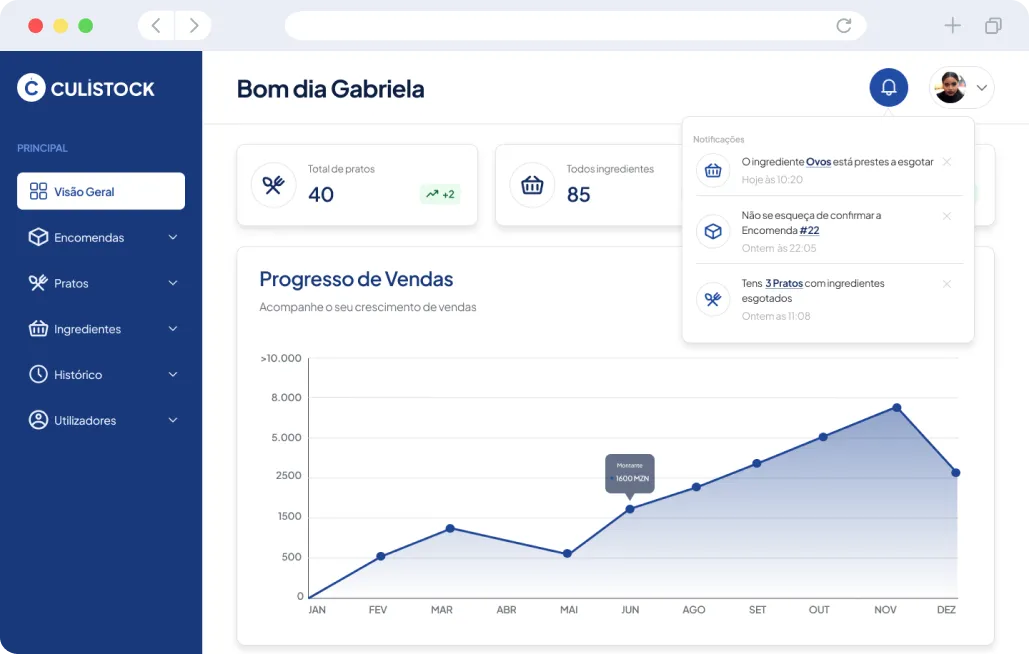
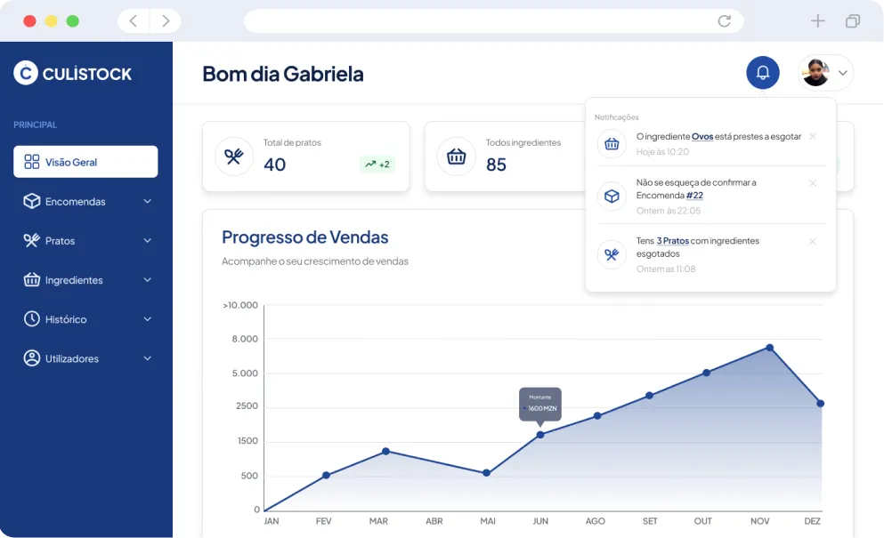
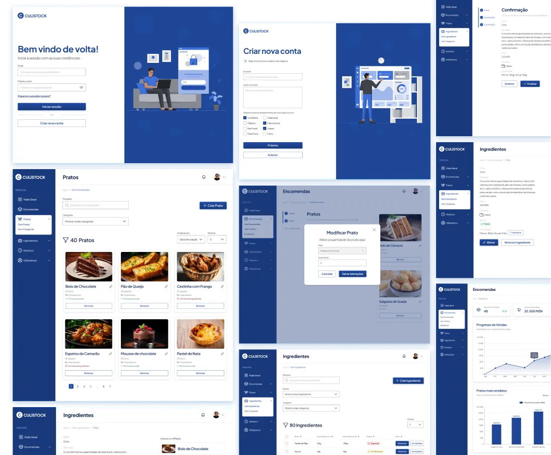
Culistockis a web application for people who do food business from home, which helps them manage their inventory according to the sales they make.
The first step was to delve into the particularities of their daily lives, understanding the operational difficulties they face daily and exploring the ambitions they outline for their business.
This process of direct involvement allowed a deep understanding of the owners' needs and expectations, thus constituting the essential basis for creating effective solutions within the scope of application development.
My goal is mainly to earn a small income for my needs and gain experience.
I'm usually not very organized when it comes to managing my ingredients.
I buy it as soon as it runs out, I don't have very fine control over my ingredients.
I register sales using my book, I was not aware of the existence of an application
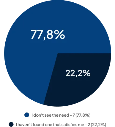
To complement the initial interviews, we conducted surveys to gain quantitative insights into the practices and challenges faced by home business owners.
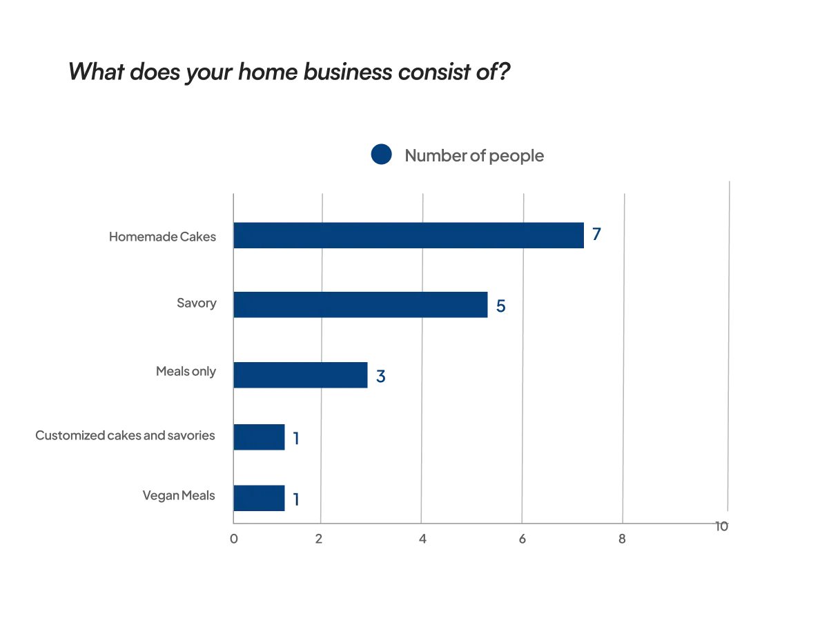
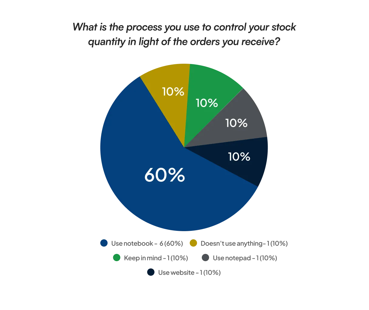
10 Responses
My main objective is to create a well-known brand that can generate profits
Sell more to target audience
Firstly a small income for my needs and to gain experience
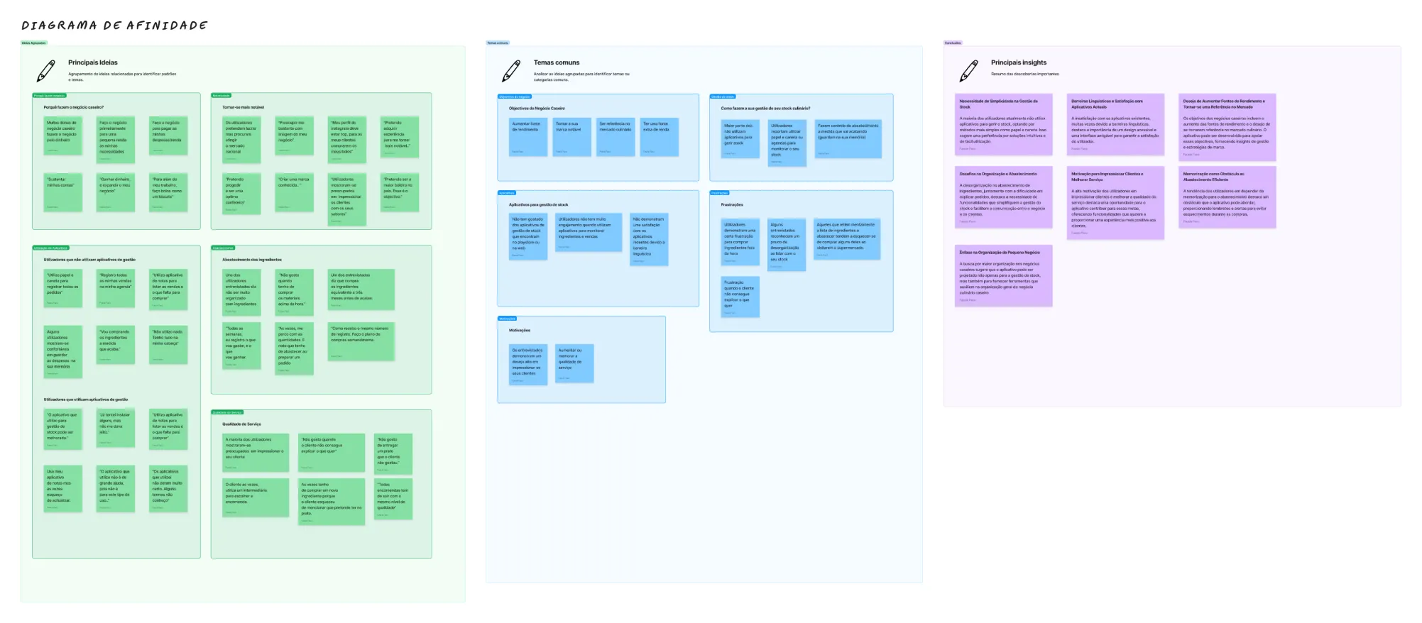
To structure the information collected during the research, I created this affinity diagram in order to identify relevant data and common themes in the project, which emerged during the interviews with the culinary business owners.
After gaining valuable insights from this project, we proceeded to create representative personas. These personas, based on data collected during interviews and surveys, serve as fictional representations of the different profiles of home business owners.
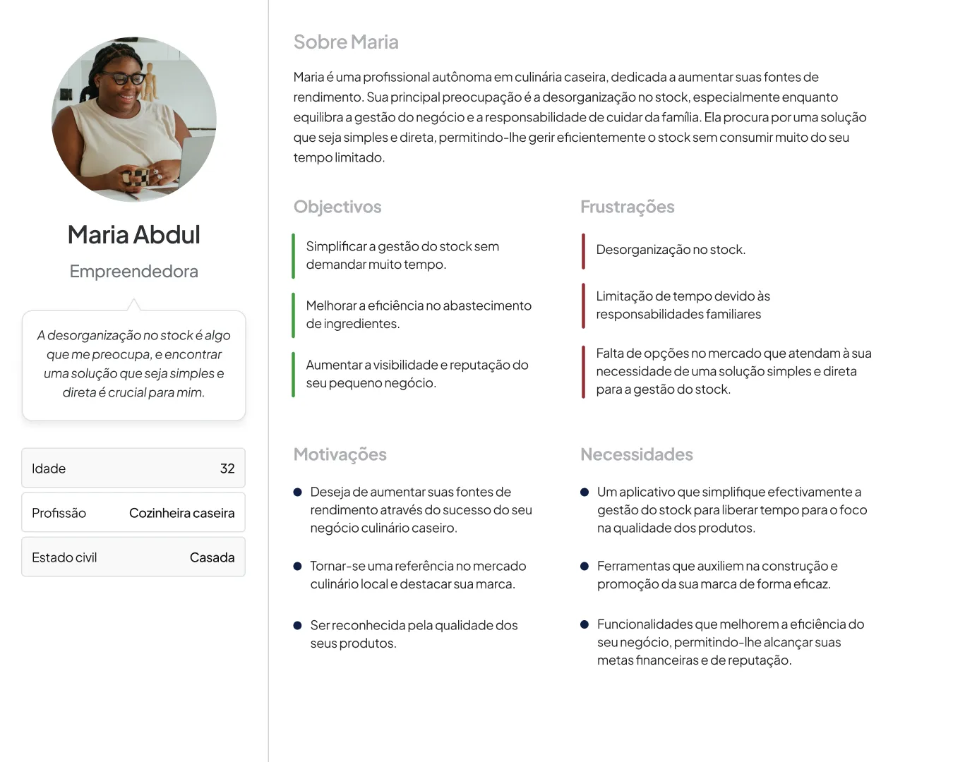
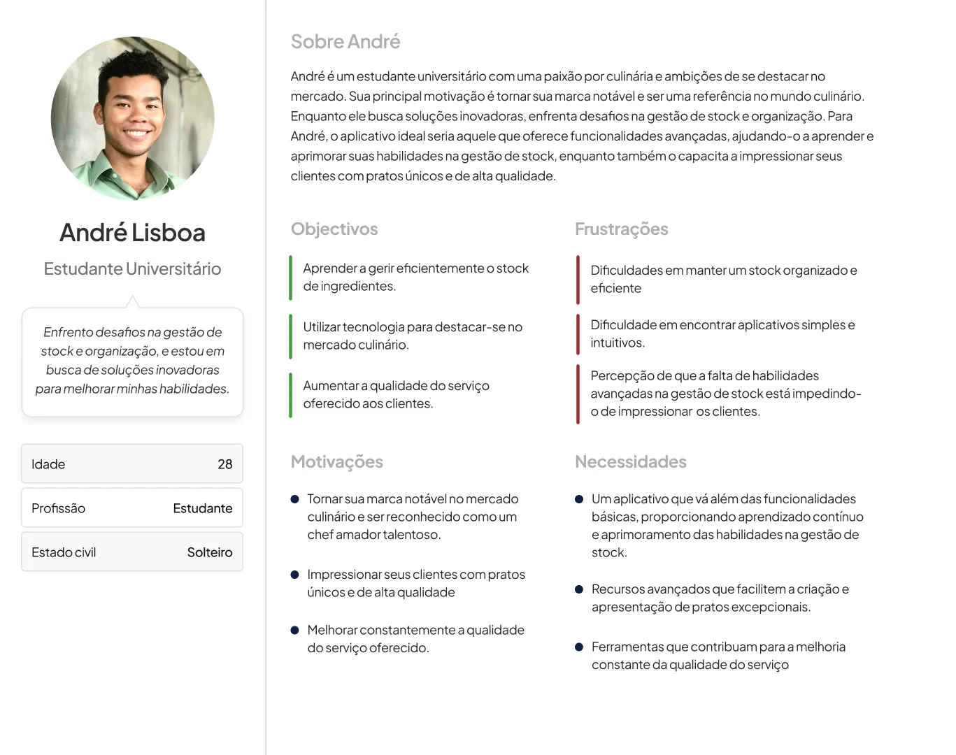
Original research artefacts in Portuguese.
During the ideation phase, we recognize the importance of conducting brainstorming sessions to generate innovative ideas, aiming to find specific solutions to the challenges identified within the scope of app development for home businesses.
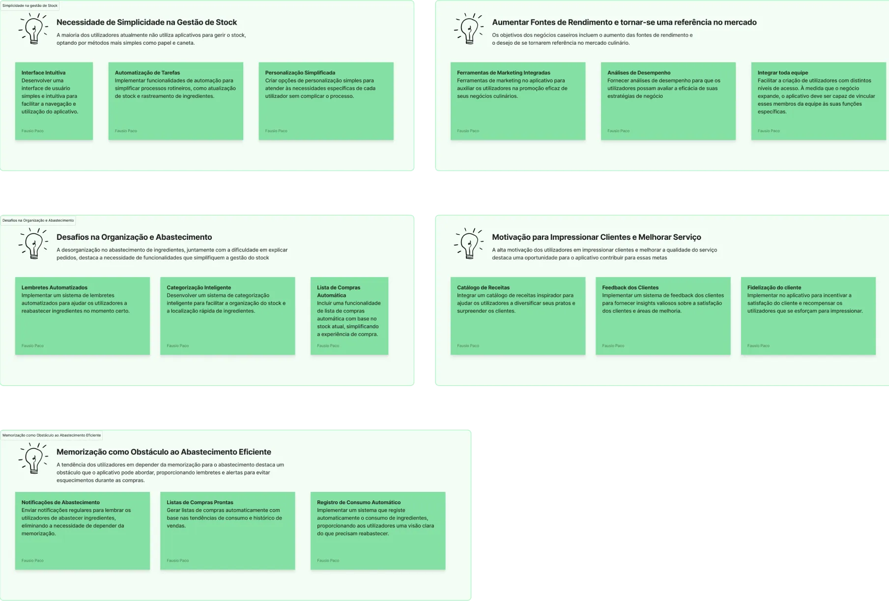
From observation to interface
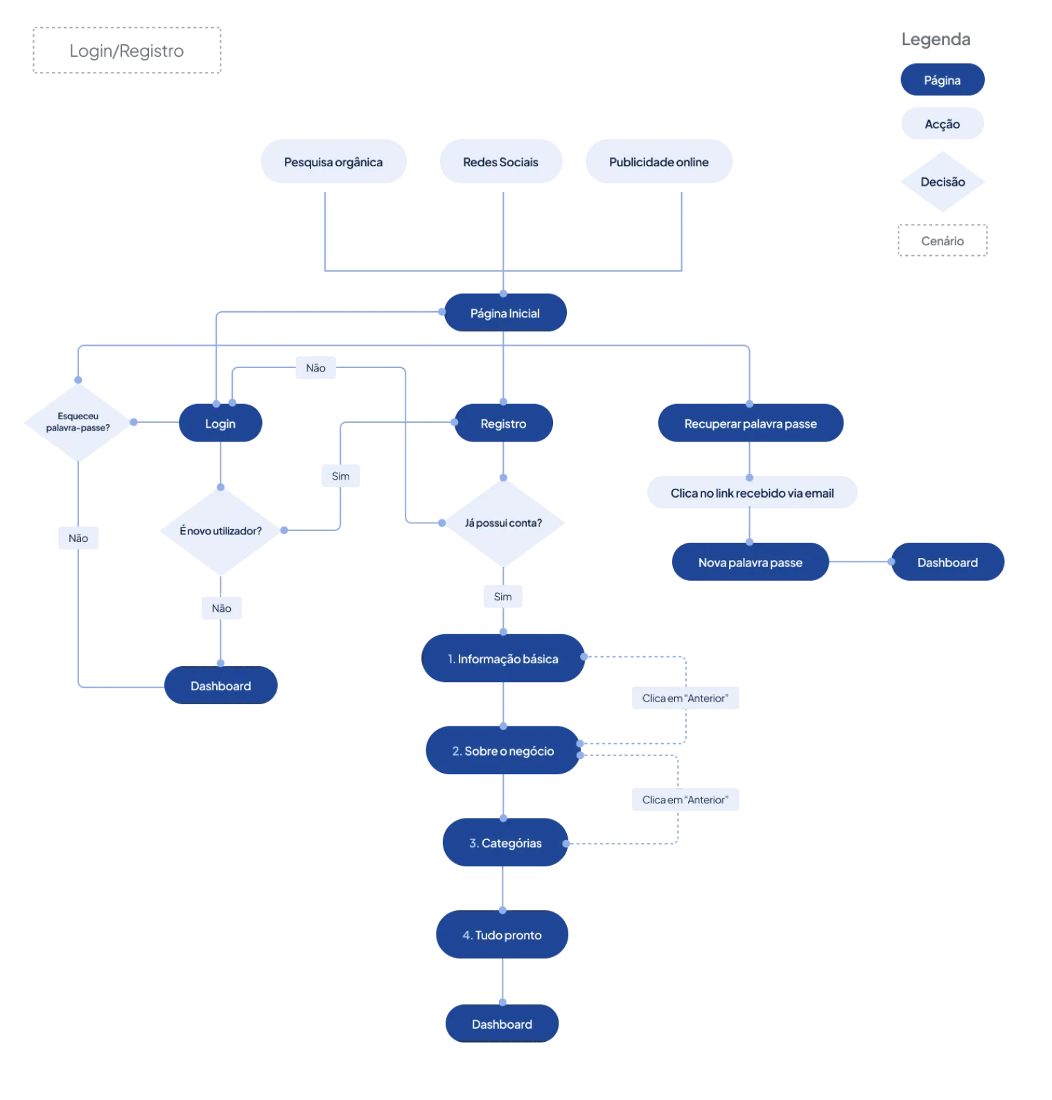
Another crucial step in the ideation phase involved creating the usage flows for this application. We carefully develop maps that outline the expected interactions and experiences for users, ensuring intuitive navigation and fluid integration of features.
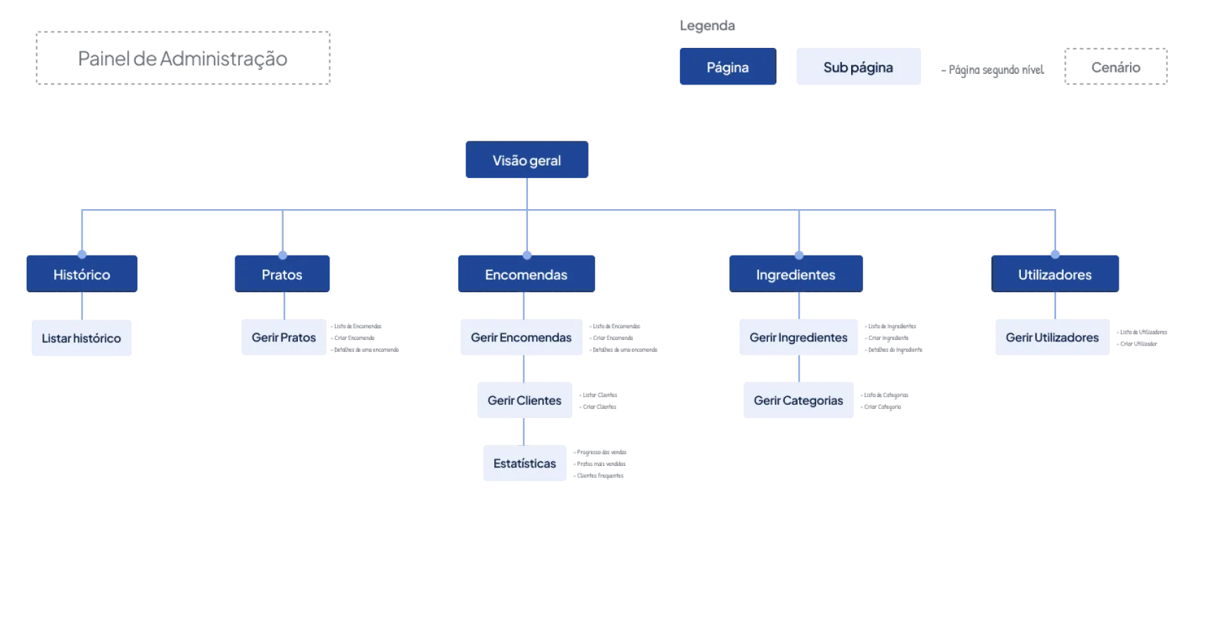
At this same stage, we proceeded with the creation of the site map. When developing the site map, we seek to optimize the user experience, ensuring logical and coherent navigation that reflects the objectives and needs identified during the research and ideation phase.
Subsequently, I created sketches in order to validate users' reactions to the structure and flow of the solution proposals.
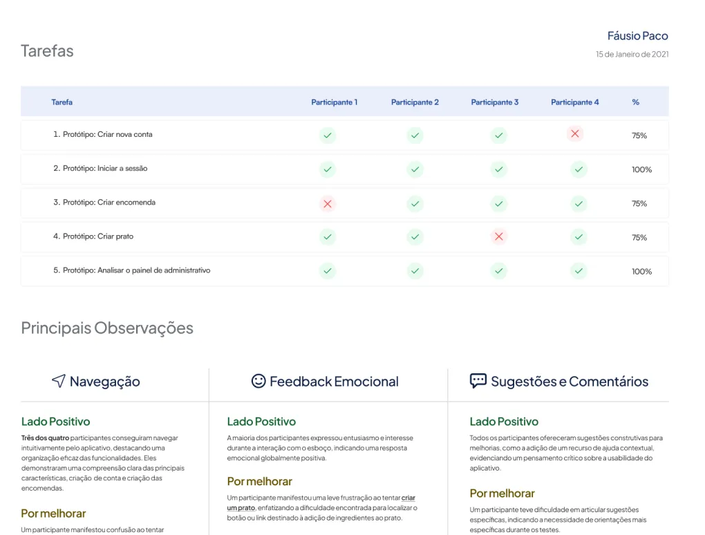
For usability tests, we selected 4 users based on the characteristics closest to the personas created, looking for individuals aligned with these profiles.
The selection process aimed to find business owners who shared these characteristics and contributed significantly to the test, with a more descriptive approach to screening questions. Furthermore, we presented the sketches (wireframes) to the participants, clarifying from the beginning that it was a black and white draft of the final product.
The task table records four people testing the sketches. The findings describe navigation in that sample and at that early stage of the concept.
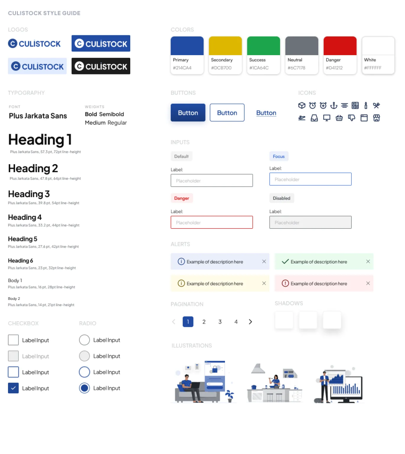
After completing the usability tests on the sketches, we moved on to the development phase of the visual identity and interface components. Choosing blue as the primary color was a conscious decision, based not only on it being one of my favorite colors, but also because it is a preference shared with my friend Márcio. This choice seeks to incorporate personal elements into the aesthetics of the application, promoting a meaningful visual connection for us and, potentially, for end users.
After analyzing the usability tests, the insights obtained were incorporated into the sketches, elevating them to a high-fidelity version aligned with the project's visual identity. Even while completing the final elements of the visual identity, the overall appearance was substantially defined and used as the basis for the final design.
When creating the interfaces, we adopted a structured approach, implementing a 4-point grid to ensure consistency across all components developed. This meticulous practice aims to ensure uniform organization and precise alignment, contributing to a cohesive and enjoyable visual experience in every part of the interface.
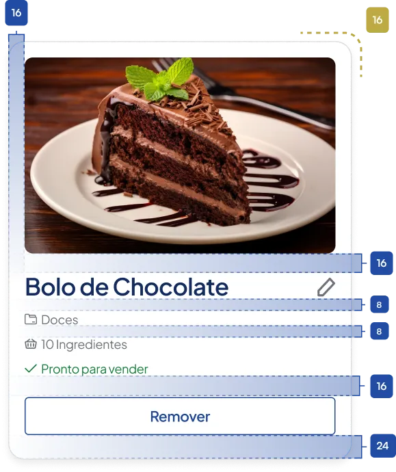
The result is a product concept supported by research, task flows, sketch testing and high-fidelity mockups. Testing made both the workable navigation and the difficulty of finding the ingredient action visible.
Frontend and backend development were proposed as a later stage. The prototype established a direction for the product; a useful next validation would revisit the difficult tasks and test the refined interface with business owners.